The data sets I am using for this study comes from public access database by the
U.S. Energy
Information Administration and the
U.S. Department of Agriculture.
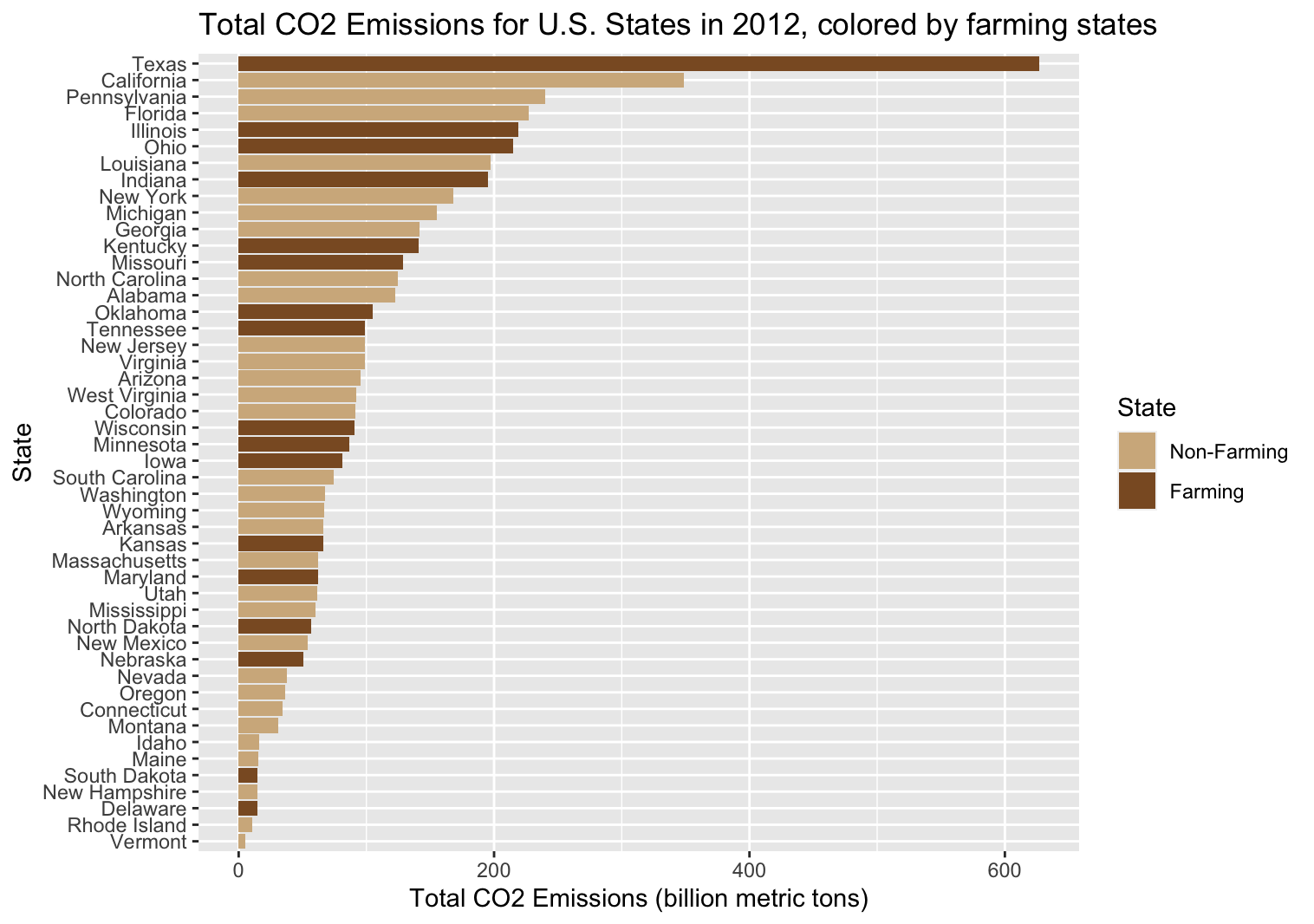
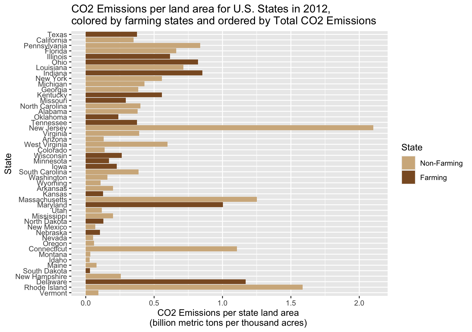
In particular, I used data on emissions by state (from 1970 to 2020), total cropland by
state (from 1945 to 2012), and total land area by state (from 1945 to 2012.)
Although the imported data sets were already clean, the time range is different
for each data set. I focused only on the range where we have all the necessary information:
5 year intervals between 1945 to 2012. Further, I narrow the data on only the Contiguous United States
(so excluding Alaska, Hawaii, and U.S. Territories)
library(tidyverse)
library(readxl)
library(sf)
library(dplyr)
# if you do not have USAboundaries installed:
# install.packages("remotes")
# library(remotes)
# remotes::install_github("ropensci/USAboundaries")

co2_emissions_state <- read_excel("data/carbon_emissions_by_state.xlsx", skip=4) %>%
    head(-2) %>% filter(!(State %in% c("Alaska", "Hawaii", "District of Columbia")))

cropland_state_regions <- read_excel("data/cropland_by_state.xls", skip=2, na="-") %>%
    na.omit() %>%
    rename("RegionsAndStates" = "Regions and States", "2012" = "2012 5/")

land_area_state_regions <- read_excel("data/total_land_by_state.xls", skip=2, na="-") %>%
    na.omit() %>%
    rename("RegionsAndStates" = "Regions and States")

us_states_cont <- USAboundaries::us_states() %>%
    filter(!(name %in% c("Alaska", "Hawaii", "Puerto Rico"))) %>%
    st_transform(2163)
To calculate values in term of total area by state, I first needed to pivot each data set, so that instead of a column for every year, the data is condensed to one column "Year":
cropland_pivoted <- cropland_state_regions %>%
    pivot_longer(cols = -RegionsAndStates, names_to = "Year", values_to = "Cropland_Area")

land_area_pivoted <- land_area_state_regions %>%
    pivot_longer(cols = -RegionsAndStates, names_to = "Year", values_to = "Total_Land_Area")

co2_emissions_pivoted <- co2_emissions_state %>%
    pivot_longer(cols = -State, names_to = "Year", values_to = "Total_Emissions")
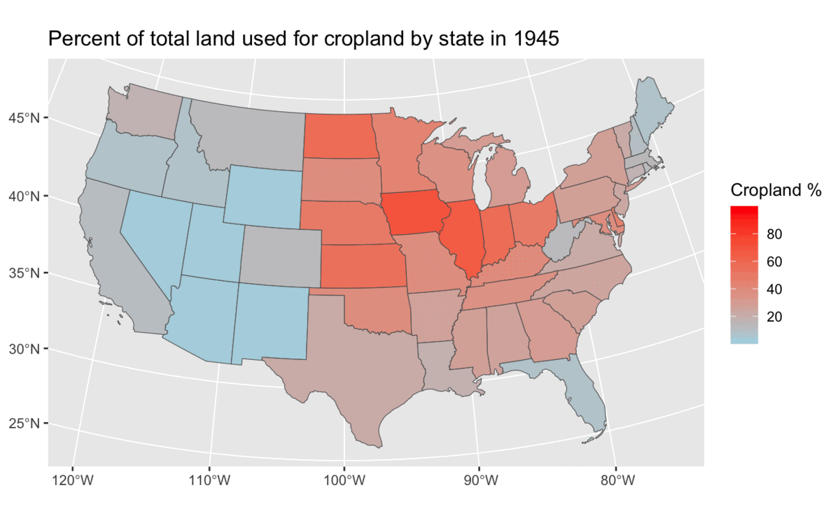
I use ggplot and geom_sf() to make the map, visualized
one year at a time. It's important to also keep the legend
consistent (i.e. same breaks):
ggplot(co2_emissions_state %>% filter(Year==1974)) +
  geom_sf(aes(fill=percent_co2)) +
  scale_fill_continuous(limits=c(0,3), breaks=c(1, 2),
                        low = "lightblue", high = "red") +
  labs(title="CO2 Emissions Per State Area in 1974",
       fill="CO2 emissions per land \n(bmt/thousand acres)")
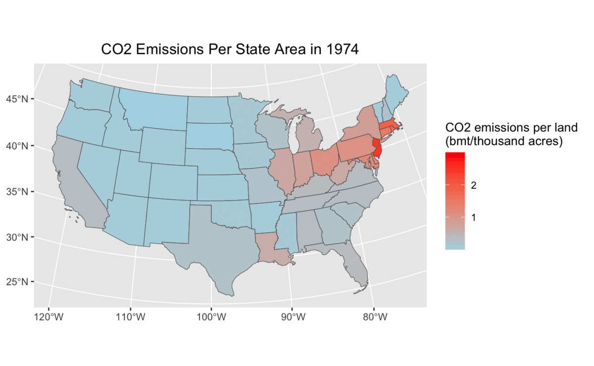
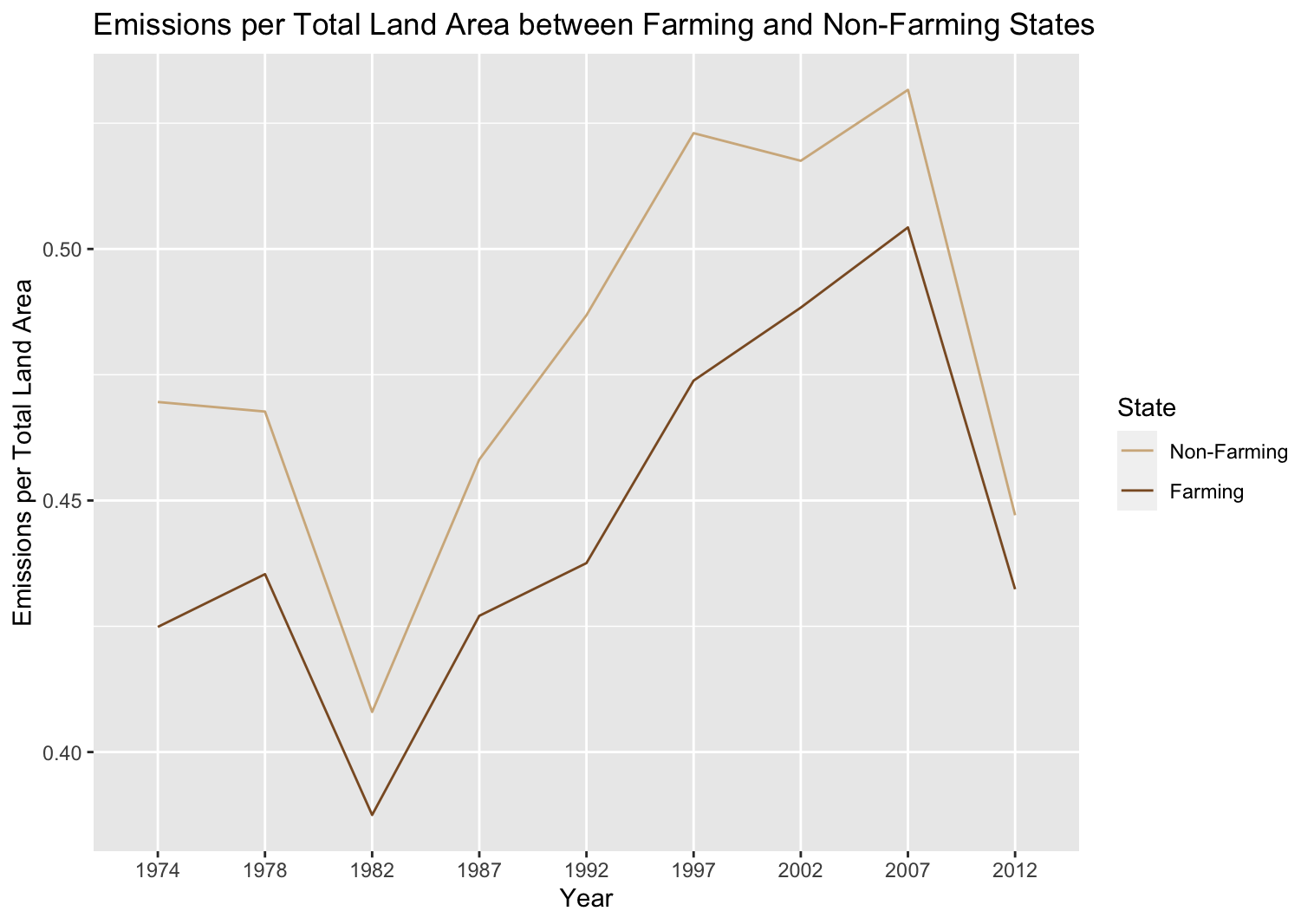
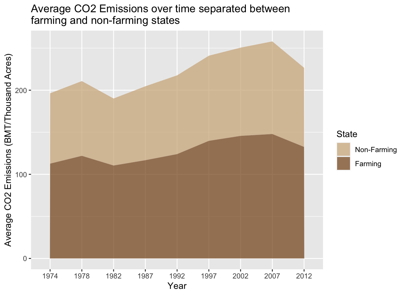
However, spatial analysis is not an effective approach to understanding change over time,
since we could only focus on one time period per map. To further our analysis, we first
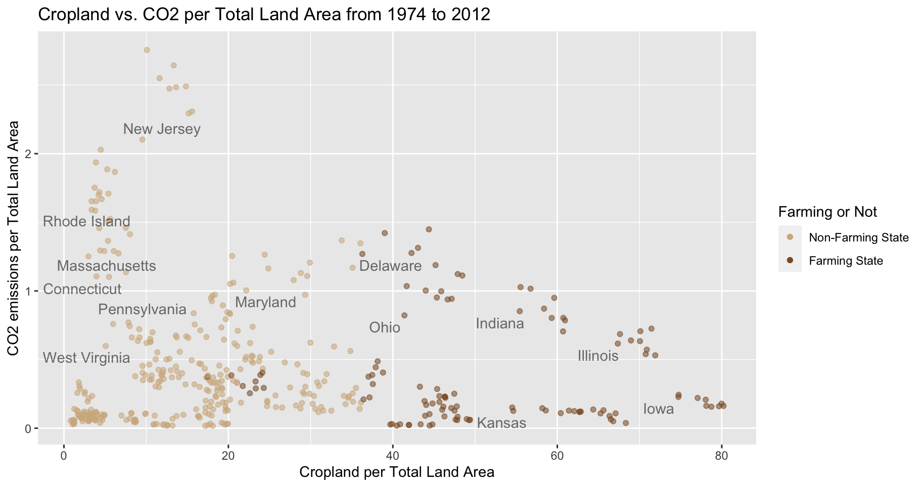
added a binary variable that categorize each state as whether or not it is farm-orientated.
This is calculated by states that are above the upper quartile (top 25%) in percent cropland area.
With this new binary variable, we can visualize how these two types of states change in
their CO2 emissions over time. In the line graph below, we can see how emissions per total
land area changes over 38 years, between farming and non-farming states:
With the calculations before, and a new binary var, use geom_line():
ggplot(co2_farm_year %>% drop_na()) + geom_line(aes(x=Year, y=percent_emissions,
                                      group=factor(rounded_farm),
                                      color=factor(rounded_farm))) +
  labs(title="Emissions per Total Land Area between Farming and Non-Farming States",
      color="Farming or Not",
      y="Emissions per Total Land Area") +
  scale_color_manual(values=c("tan", "tan4"),
                       labels = c("Non-Farming State", "Farming State"))